Sunday, 22 October 2017
Friday, 20 October 2017
Thursday, 19 October 2017
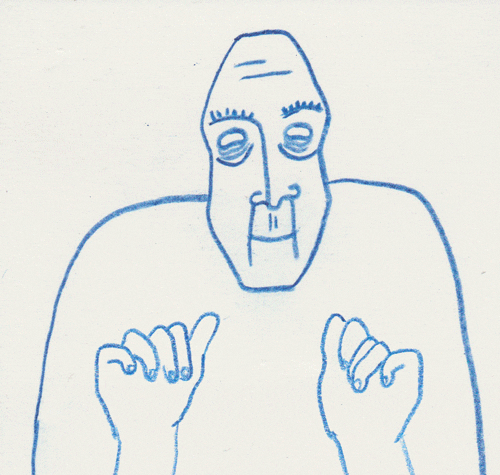
Advert/Digipak - Mood board and Inspirations
I created a mood board that involves my inspirations for the tour poster and things that I want to involve;
0 by Yolanda Wallbanks
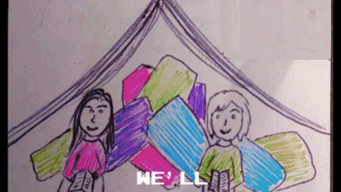
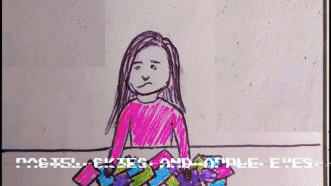
I really like the idea of editing the pictures of Robyn in a way that means that she look like a cartoon or a drawing in order to have it relate to the childlike drawings that we are using for our music video. Additionally I want to stick of the colour themes of pinks, blues and purples (even if its just subtle I think it will still be really effective). We also took a picture of Robyn that is her laying on grass, I really like this picture and have decided that I will use that in some way for my tour poster ideas.
Wednesday, 18 October 2017
Production Diary 10
The storyboards that I created I feel are very effective, they have aided me greatly when it comes to planning the different shots we should get during the filming days.
 It will also help when we begin to editing, however we must make sure to allow ourselves flexibility of editing and not try and make the video exactly the same as the storyboards. For example if we edit it together and then feel like certain parts are too long or do not work we have to change it to make it fit instead of being stubborn and not changing it.
 Tuesday, 17 October 2017
Animatic Storyboard
I created an animatic storyboard from the storyboards I drew in order to have more of a visual idea on what our music video will look like in the editing process. I have found this really useful when it comes to planning the different shots we should focus on getting.
Storyboards
I created a series of very detailed storyboards which I am very happy with. They will allow us to effectively be able to plan the shots we need to get during our filming days and will also come very handy when we edit our first draft as we will already have an idea of what we want;


Saturday, 14 October 2017
Production Diary 9
 After creating and editing mu green-screen practise and the lip-sync I am feeling confident with the work I have done and am ready to begin the production elements and to also start thinking about our tour-poster and digipak designs, which I have had a few interesting ideas for already.
Next I am going to produce an animatic storyboard to help us when it comes to editing and also the filming so we stay on topic.
Thursday, 12 October 2017
Actor Release Forms
I put together a actor release form in order to make sure we have proper signed permission from each of our actors and their parents/carers;

 |
| Robyn's Form |
 |
| Finlay's Form |
 |
| Arthur's Form |
 |
| Isabel's Form |
Wednesday, 11 October 2017
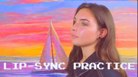
Lip Sync Practice
The lip sync practice went well I believe. Although at first Robyn felt uncomfortable in front of the camera that was soon sorted when I decided that i would sing along with her which make her feel more comfortable. As Robyn was not completely confident with the song we printed out the lyrics and I help the just below the camera for Robyn just in case. In addition I underlined the specific lyrics that we wanted Robyn to get right because they are the lines that we are most likely to use.
When it came to editing the audio on top of the video I felt that the hardest bit would be the timings. However surprisingly I found this pat very east. The bit that I actually found most difficult was turning up and down the different audios (which after I watched a youtube video on it I realised how easy it was).
Overall I was very happy with how my work came out and I am very proud of myself. Although this is basic editing I have never used Adobe software before and this is a big achievement for me.
Tuesday, 10 October 2017
Monday, 9 October 2017
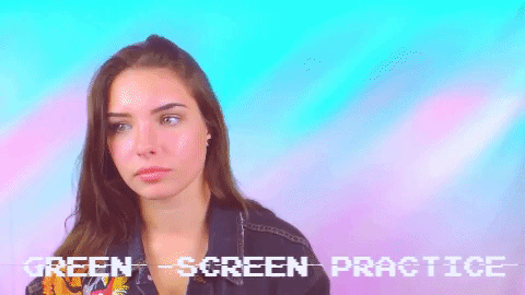
Green Screen Practice
This is the final outcome for my green screen practice. I feel that it went very well and I am happy with the outcome. I picked up the skills very easily even though I have never used this editing software before. I also really like the back ground I picked however I feel that it maybe doesn't properly fit with her jacket so we may need to look at other possibilities to use for the background.
Green Screen Practice - Creation
This was the video I used to help me edit
Generally I found the editing of the green screen quite easy, the hardest parts for me was getting my head around the slightly outdated version of Adobe Premier software making the video that I learnt from different to the one I was working on. I found everything else very easy and I really enjoyed creating it.
Sunday, 8 October 2017
Kirsty's Institution Logo Ideas
This year Kirsty and I decided that like last year we would create individual logos for our music video production company and then sow them to each other to decide which one we shall use;

This design I do really like, it had a bird in it which our focus group suggested we have as well as our company name in bold letter so it does stand out. However, I fear that this may hello too boring for what I believe we want to go for with our production company which is a childish bright theme, additionally I feel that this does not fit with the colour scheme that we have for Robyn (more pastel and bright colours).

This second design I believe is really good, it fits in with our colour scheme of pastel pinks and blues perfectly as well as the childish theme we have with the building blocks and the little smiley face. However, at the same time our target audience are teenagers and young adults so it may be slightly patronising to have such a childish logo (one that looks like it would fit perfectly for a pre-school).

The simplicity of this logo I believe is the best part about it. it does not take away from the production company name and I believe it is really sweet. Although the colour is yellow i think that this can hello over looked due to the sweet childlike font and smiley face. Additionally it is the perfect amount of professional and childlike so it is much better than the previous two in that sense making sure not to be too boring or too childish. I think we should really consider this image as our final logo design.

This design is also very good, I love the colours as they are bright and sweet (like what we have with Robyn). The little symbol in the left corner is absolutely adorable as well as showing what our company is all about, music. This is also one that I think we should consider for our final logo design.
Overall I believe that my favourite logo design is the third one as it is just so sweet and simple, however I feel that we should let our target audience decide as they are who we are aiming our product at.
Saturday, 7 October 2017
Friday, 6 October 2017
Production Diary 8
 I am feeling very confident in terms of planing. I feel Kirsty and I have nicely and thoroughly gone through all of the aspects of pre-production (although I have yet to do a lip-sync or green-screen practice).
I feel very confident and excited to start the filming process and compared to last years foundation portfolio where we had not planned much before we started the filming (which was something that we knew we needed to work on this year).
There are still a few things that I need to complete and these need to be done before we can start the filming process;
- Actors release form
- Green-screen and lip-sync practice
- Animatic Storyboard
Thursday, 5 October 2017
Wednesday, 4 October 2017


Sunday, 1 October 2017
Subscribe to:
Posts (Atom)